Web designers typically need to follow different design strategies. Some of these stratagems are based on the medium for which they are doing the design work. This is because every medium provides a slightly different UX or user experience. If you are an aspiring web designer looking to master the art of mobile UX design, you will soon find that doing the design for a mobile app is different than doing it for a mobile website. While using a specific mobile app, users are not interested in simply accessing a mobile version of a particular site. Instead, they are looking for a different and unique experience that will make them come back to the app again in the future. If they do not find the app worthy of their time, they are simply going to delete it after they have opened it only once. It is thus important to focus on mobile designing that can help in enhancing the UX as a whole.
Here are some of the best practices for designing mobile UX.

Ensure intuitive navigation for all users
Whether you are designing for a mobile app or a mobile website, you must focus on making the navigation features more intuitive than what you would normally do for a typical desktop site. Your target users must immediately understand how they should navigate through the new mobile website or app. This is something you can achieve by using the standard recognizable design patterns like hamburger menus and common icons like the chat bubble to indicate messaging and the familiar home icon to denote the home screen. Make sure that your users do not have to ponder about how they can navigate through the mobile app or website that you create as this can make them lose interest and look for a competition app or website that appears simpler to them.

Choose UX design elements based on user goals
Typically, a person’s goals while using a mobile website or an app are different than when they are accessing a desktop site. This means that they would have access to the information that they need to have at a specific moment and not waste their time on things that they do not have to explore at that specific point in time. Therefore, if you have bundles of information to offer to your users, you can safely tuck them inside menus and submenu options. It is thus important for you to put yourself in the shoes of your users and consider the things that are most useful for them. If you are designing a banking app or a ticketing app, it is important to have a login feature with it to enhance security. However, you do not need to implement the login feature for a mapping application.

Always practice responsive designing to ensure a seamless experience in all types of viewing devices
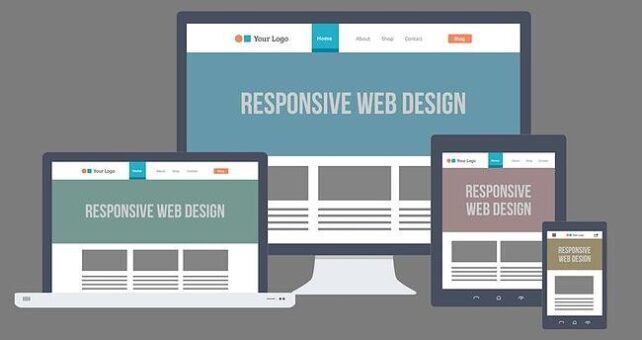
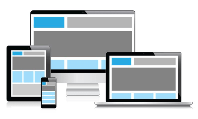
One of the ways how you can make the app or website user-friendly for the target users is by adhering to responsive designing practices. A user looking to have access to the content should be able to have a seamless way of doing so whether they are using a desktop website, an app or, a mobile website. Design elements that are used in them should precisely mirror one another. In other words, the mobile website should not look different from the desktop website. This can not only help to ensure a better user experience with the app and/or the website but also develop trust in the brand in the minds of the users.

Make sure that the site is user-friendly
The user-friendliness of a mobile app can make things simpler for a person when he or she is looking to perform a particular function while visiting a mobile app or website. This can not only help to wrap up the task quickly but also develop trust and reliability in the minds of the user. One of the ways to make a mobile app or website user-friendly is by getting rid of everything that is not necessary for the users when they are looking to manage a task. The mobile interface should be simple and intuitive so that people can handle their operations smoothly. A common example of making a mobile app or website user-friendly is the trend these days where many online shopping stores implement a camera option that shoppers can use to put in credit card information. In this way, the users do not have to type in credit card information but have the app or website read such details automatically.

Provide sufficient personalization features
Personalization or customization is one of the basic things every user looks for when they are using a mobile app. This can greatly enhance the user experience of the app. Personalization features can even help the users to achieve their marketing goals. Personalization tools should be implemented in an app in such a way that it allows them to access the content easily and also benefit from all the features that are present in the app. They should also be able to stay away from things that are not relevant to them. In this way, they can get rid of distractions, streamline various functions like managing payments and see to it that promotional messages are in line with the needs and expectations of the visitors.
Nevertheless, it is also important to note that implementing endless personalization features can also be confusing for the users. You should make sure that the extent of personalization features implemented in a site matches the expectations of the users instead of making them feel overwhelmed and apprehensive.

Mobile browsing should be speedy
It is also important that the mobile app or website provides a seamless and fast response without any lagging. The mobile internet speeds are typically slower than what is normally finds with desktop and laptop internet speeds. Most of the devices use 4G internet these days and although they are faster than 3G, there are still many parts of the world that do not have access to 4G internet. Therefore, you must design the UX in such a way that it delivers fast and responsive browsing for both mobile apps and websites.

Use only the most common gestures
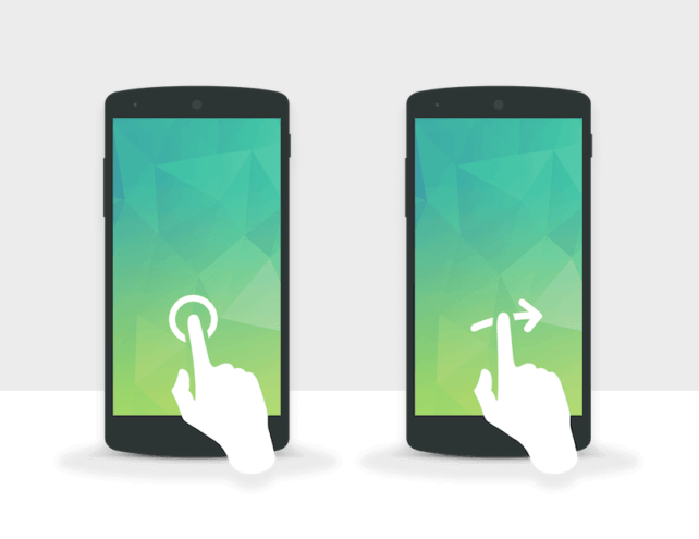
One of the things where certain designers tend to go wrong is playing with the gestures when they are looking to have access to any kind of content or information. It is always good to stick to established and well-known gestures instead of trying out something new or relatively unknown for the users. When the users find that they can interact with the content using common gestures like swiping and pinching, they can easily use the website and come back again in the future.
Following these guidelines described above can improve the quality of the UX for a mobile app or a website. It can also encourage users to explore the app or website with greater frequency. Investing in the best quality UX designing can also be good for a brand in both immediate as well as long term.

