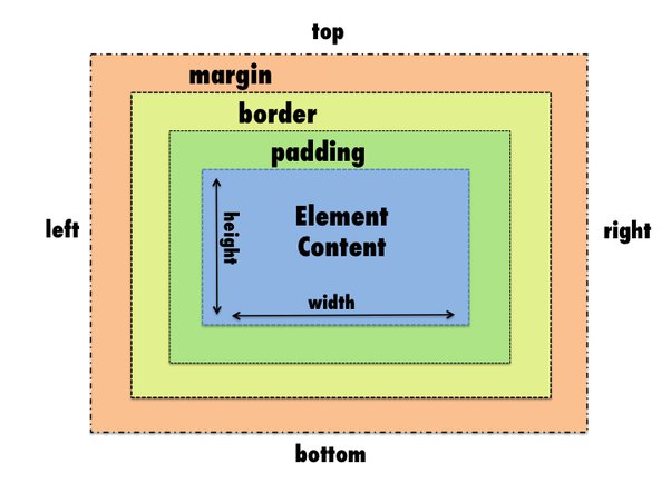
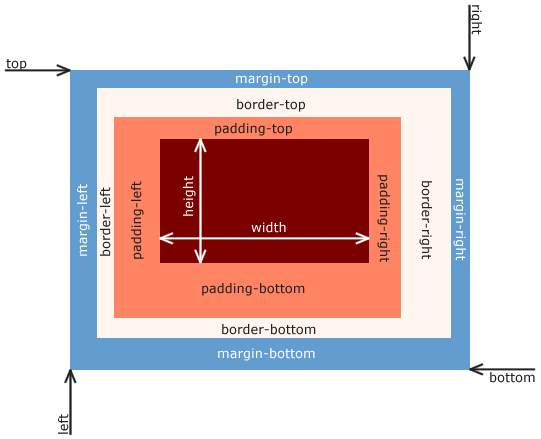
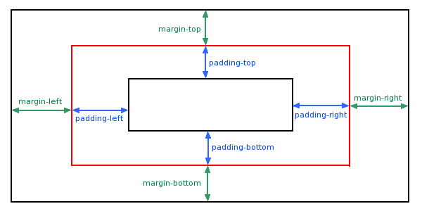
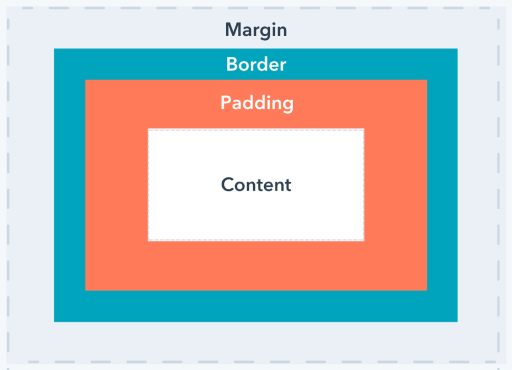
CSS margin and padding are two very important CSS properties. They are used to create space between elements on a web page, but they behave differently. If you’re confused about how to use these properties, then here are tips that should help clarify things for you. The CSS Box Model describes the rectangular region of an element on a web page, which is generally called the “content area”. The content area is surrounded by optional amounts of space – white spacing between elements on the page, margins around the box, and padding within the content area.
What is CSS?
CSS is a set of codes that make up the style and look of your website. There are many different codes you can use to change the look and feel of your website, but the two most important ones for this article are padding and margin.
The Difference Between CSS Padding and Margin
Margin is the space around an element on any given side, including top, bottom, left, and right. A margin will push another element away from it.
Padding is the space inside of an element, between its border and its content. Padding pushes the border away from the content. For example, if you have a paragraph with 10px left padding and 10px right padding, then the paragraph would have 20px of space within it on either side of its content.

When to Use CSS Padding
Padding is the space between the content of an element and its border. If you have a lot of text on a page, adding padding can help to break up the clutter. It’s also good if you have an image in the middle of your text because it creates more white space around it. Finally, padding is good if you want to increase the size of your elements without changing their appearance.
How to Use Padding and Margin Together
Padding is a CSS property that adds space between the border and content, in a similar way to a margin. Margin, on the other hand, spaces out the border from its neighboring elements. When working with padding and margins, it’s necessary to decide which one should go inside (aka content) and which one should be outside (border).
When to use CSS Margin
When you want to space content away from other content, the margin is usually the best option. This is especially true for things like lists, rows of text, and other components that should be spaced vertically or horizontally to improve readability. Margins don’t change the total size of the element they’re used on—they just shift it inwards from its natural position.

Why Proximity Considerations Matter
When you create a layout, you should always consider what will happen when elements are re-sized. For example, if your content is smaller than the padding and margins of an element, then those gaps can become larger as the user reduces the size of their browser window.
- Bullet Point: Don’t Make Elements Touch
- Paragraph: You might think that lining up elements flush against one another looks nice, but it’s much less pleasing to the eye for a user to scroll down a page and have text touch elements all along the way.
How to decide which one to use
A lot of people say that you should use padding when designing a website, and others say you should use margin. It is best to research the debate and make your own decision about which one to use. You can also use both if you like! How do we know which one we should use? Well, there is no clear answer to that question and it all depends on the situation. Padding and margin are both very useful and it can be hard to decide which one you should use. There are a few factors that may come into play when deciding which one you should use; such as how much space an object needs, what type of elements the padding or margin will be used with, and if the element is contained in another border or container.

What Goes Inside the Padding
Padding is the amount of space between the edge of an object and its content. Margin is size of the space outside the edge. The padding is used to set the space between the content and the border. It doesn’t matter what you put inside of it, but it does need to be at least as big as the border width. The margin is used for spacing between elements. It can be put on either side or both sides, but it needs to matches the size of the border width.
What Goes Inside the Margin
The margin goes around all the content inside the container. Margins are helpful for adding space between something and other things around it, as padding does. For example, if you want to put two buttons side by side on a website, you can put them next to each other with some space in between using margins.
Conclusion
In conclusion, it’s important to make sure that you use both CSS padding and CSS margin in order to achieve the desired layout. If you only use one or the other, then there will be a lot of leftover space on your webpage. There are many different types of layouts that you can create with CSS, but it’s important to understand the difference between padding and margin. Padding is used to create space inside of an element, so it’s used on the inside. Margin is applied outside of an element, so it’s used on the outside.

