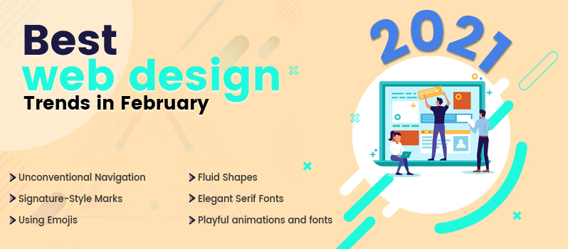
The year 2021 has already started and we are still trying to cope up with the changes that have resulted from the worldwide pandemic. There has been a major shift in the way imagery is being used these days in the world of web designing when it comes to creating new websites. Challenges in the workplace have led web designers to come up with new ways to design websites and innovative ways to create the website visuals have recently been implemented. Here are some of the ways in which web design practices have taken shape in February 2021.
Unconventional Navigation
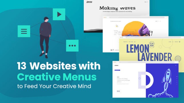
Experimenting with the navigation menu and implementing unconventional elements is a great way to capture the attention of your audience. Web designers are always looking to create visual interest with their work and it is possible to achieve this by mixing up the size and location of the navigation menu. Even though you may think that working with a hamburger menu or a top navigation component in a website is the right way you should go, you can also play with nontraditional navigation features and balance them with your surrounding content and overall menu items.
The great thing about playing with the navigation bar is that you also get to explore so many options with these. The unexpectedness of these navigation features makes them ideal for you when you are looking to attract the attention of your audience. There are many tools these days that you can use for customizing the appearance and functionality of the navigation bar. You can place the navigation menu along the right section of the screen. Another way of working with the navigation is to shift it from the top part of the page to the bottom section of the home page. You can also make the navigation bar float in a section that you like. In this way, you can allow users to access the navigation any time they want without compromising on aesthetics.
Fluid Shapes
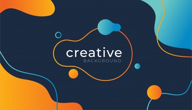
Over the last few years, it has been a common practice within the world of web designing to use different shapes for coming up with visual theme. Creating geometric patterns and having them in the background can have a visually stunning effect. In recent times, these shapes have evolved to develop a more fluid state and designers can now add further elements of backgrounds, animation, and shapes so that they can have a harmonic flow. Eventually, they can be used for enhanced visual elements like image frames, and unique homepage art. You can also work with layering effects, small patterns, and other forms of aesthetic elements. The main reason for using the fluid shapes is that they can help in coming up with a delightful and smooth interface for the users.
Signature-Style Marks
Another powerful design element that you can use for your website is signature-style marks like headlines and logos. These features can help in adding a personal touch to the website. This trend has given way to the birth of novelty typefaces and fonts. While it is not necessary for you to create an actual digital version of your signature, you can still use a font that replicates a similar type of feeling that you can normally evoke from your handwriting. By getting in touch with a professional expert, you can focus on having a unique experimental typeface that can suit your website design.
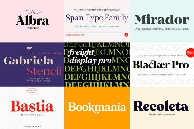
Elegant Serif Fonts
Sans Serif fonts have long been regarded as the staple for web designing projects. While this has been changing for some time now, there are still many web designers who rely on Sans Serif fonts to do the trick for them. They are widely preferred for their simplicity and sleekness. The advent of larger and better monitor screens has paved the way for a renewed interest in these fonts among designers. These larger screens make it possible for the Sans Serif fonts to appear much less cluttered and more elegant due to enhanced space within the words. Higher and better resolution ensures more clarity among the font letters.
Using Emojis
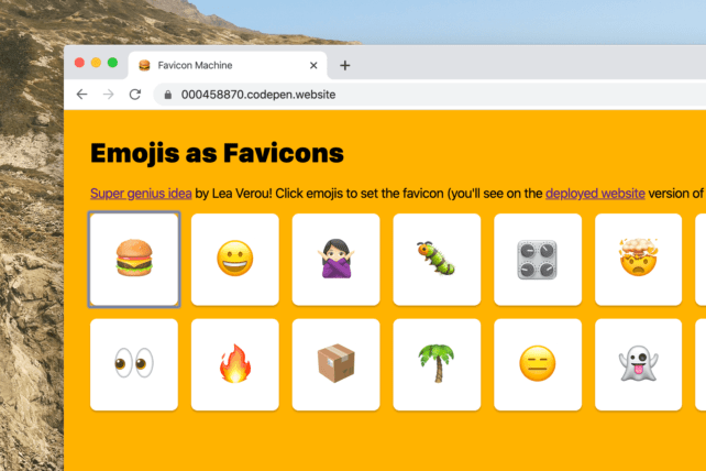
Emojis provide an excellent way to interact and bond with the audience. Digital interactions have completely changed the way people choose to interact with one another. Whether people are located just a few miles apart or living in some other corner of the world, people are using emails, group forums, social media networks, and messaging applications all the time. This has made playful emojis extremely popular among all types of users. The widespread acceptance of emojis as a tool for communication has also led web designers to use them in multiple ways. These days the web designers experiment with different types of emojis to make the look and feel of the website more interesting. The emojis can be implemented into the main website content. You can leverage the illustrated emojis as gestures to communicate the essence of the brand and its sentiment. Such non-verbal messaging can help you to appeal to all types of end-users. Communicating with your target audience can be streamlined with these visual elements that enable you to take on a non-verbal approach.
Playful animations and fonts
Companies these days love to work with animated fonts and type elements that are mainly used for decorative and aesthetic purposes. Such a creative design trend is of course different from traditional uses of types and fonts and can be effective used for creating clever font pairings and customized fonts. One of the benefits of using a string of words for their animated quality is that you can use the fonts in any shape and style which is in contrast to the typical horizontal sentence format that goes from left to right. One major difference to the standard content fonts is that the main reason for using them is of course the aesthetic quality that they can produce. Therefore, web designers can use this technique or method to specifically convey a visual theme, marketing or a branding objective, or play with a certain vibe. The web designers can also combine the best of unconventional methods with traditional ones as such a contrast never fails to attract the attention of the visitors.
Light Colors
A very popular web design trend in February 2021 is to work with light colors as they can enable designers to create stylish designs for the web interface. While it is true that light colors do not fare well when it comes to print designs, they do maintain all of their richness and enable designers to achieve the effect that they are looking for. The beauty and elegance that can be assured by these colors often make them even more desirable than the dark and bolder shades. They are not only soothing to the eyes but they can also enrich the experience people have when they visit the website.
Exploring some of the design practices that are described above can provide you with the creative ways you need to design stunning and beautiful websites. It is due to this reason that web designers in February 2021 are looking to implement them in innovative ways when they are looking to create stellar web designs.
